The Place
In Design
The Place
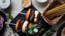
In one of the most beautiful squares in Italy, Piazza Sordello in Mantua, The Place was born. An innovative concept that brings to the Lombard town a refined cuisine with the use of quality products. A perfect place for locals and tourists, for a good breakfast, a tasty lunch or a refined aperitif.
The big international metropolitan cities have inspired the restyling both in the furniture and in the choice of the name. A contemporary touch in a historic city full of Renaissance art.
ClientThe PlaceServicesNaming, Brand Identity, DesignYear2022
Naming
For the study of naming we immediately identified some key points: the desire to break with tradition and bring novelty in the square and the need to represent the wide variety of offers for breakfasts, lunches and appetizers. So we imagined, right from the start, a modern name that could create in the mind the idea of a place to stop and spend a pleasant break, in the heart of the city.
So The Place was born, not just any place, but THE place. The one where you can sit and relax in one of the most beautiful squares in Italy, sipping a drink or enjoying a delicious dish. The payoff “Eat, Drink & Repeat” is perfect to invite customers to stay as long as possible and… Come back again!
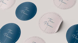
Brand Identity
The main colors chosen for The Place are light pink (code Ncs S 1005-Y90R) and blue (code Ncs S 6030-R90B).
In the brand identity starting from logos, business cards, placemats and menus up to the decor of the room, everything fits into a perfect frame of colors and shapes that imply an in-depth study of the brand.
The tones used for the development of the materials emphasize the contemporaneity of the concept, while giving a touch of harmony in line with the company philosophy.
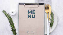
The Menu
Also the menu is contemporary and elegant, minimal and clean made by alternating light pink with blue, the key colors of the whole project.
“Stay and Enjoy” is a sweet way to capture the attention of the customer and entice him to read the alternatives proposed. The staff of The Place is ready to welcome and delight all guests with refined dishes and drinks.
The menu is printed on paper but also accessible via QR Code, for a more smart reading.
Now you just have to try it! From April 4 has officially opened The Place.